Art gallery interiors that create intimacy between you and art .
“The ideal form of the gallery as a white cube is inseparable from the artworks exhibited inside it.”
[Brian O’Doherty – Inside the white cube]
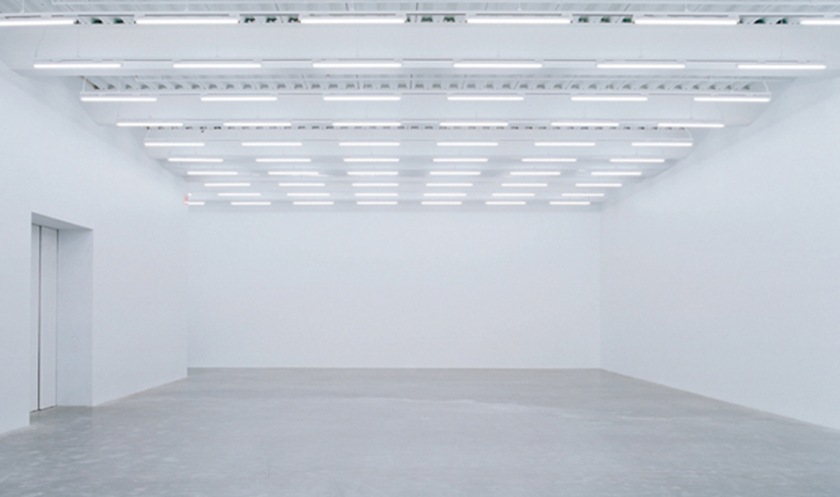
Today, we are all familiar with the “white cube”. If you’ve ever been into a contemporary art museum, you’ve definitely experienced it: plain white walls, polished floors, basic furniture, artworks evenly lit from above (with the quiet help of artificial lighting).
This aesthetic, first experimented in the United States in the 50s, has come to define our idea of space in an art gallery. Its concept focuses on the intense relationship between space and visitor.
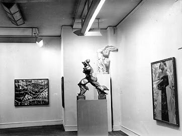
Alfred Barr’s “Cubism and abstract art” exhibition in 1936 – MOMA, New York. First example of the revolutionary “white cube” display method.
> The interior
Total white abolishes any perceptive connection with reality, emphasizing a quasi-religious atmosphere in which time and social space are excluded. This neutrality makes the viewer concentrate on individual masterpieces, with nothing interfering with the experience. In this way Art frees itself from the idea of the exhibition as “introduction of a piece into a room”.


“We have to be able to forget that there are walls and have found no better way to do that, than with pictures. Pictures efface walls. But walls kill pictures.”
[Georges Perec – Species of Space]
> The viewer
Let’s now focus on the visitor’s attitude. The space we have to interact with is aseptic, low on human presence: a kind of space in which the reception desk and the restrooms are so hidden that you can’t find them. This interior liberates the public from the sensation of being observed, favouring a personal connection with the artworks.
Marcel Duchamp – “Étant donnés 1 la chute d’eau, 2 le gaz d’éclairage”
Is it a coincidence that in the same years Marcel Duchamp proposed the installation Etant donné ?
[read all about Duchamp’s installation ]


Due to this lack of real life objects, the viewer is led to an attitude of reflection. In this way the “white cube” perfectly contributes to the aesthetic of silence: nothing is to be touched and people are rather quiet, no one laughs or is allowed to talk loudly. To the extreme, this atmosphere might even intimidate a less prepared public, making them uncomfortable in such a situation. What if we were intruders?
Out of the box / White fetish?
Ultimately, the “white cube” is a sort of label. It marks the shift from the gallery being the container, to it being the content itself.
Perfectly recognizable from outside, the “white cube” is conceived as a place free of context, out of daily life.
It says: “in here you find art”. And it establishes a separation between what is to be kept outside and that which is inside.
The hardest part is to apply this concept of gallery without forgetting the context, something which is done by David Chipperfield in his Am Kupfergraben 10 Gallery in Berlin.
Read more >>> Am Kupfergraben 10 Gallery | David Chipperfield
Other examples of buildings successfully integrating their “white box” interiors with the surrounding context:


After all, most museums and galleries still employ the “white cube” as the favored way for displaying art. But how often is it used as a model beyond its real meaning?
Passing on the intricate roots (social and historical) which came together into the well-known “white cube” concept, we can’t forget that some artists proposed over the years their own personal revolutionary idea of gallery space.
Kurt Schwitters’ Merzbau (1923-44) was an ever-changing gallery. Friedrick Kiesler proposed a cornerless panel setup for the Art of this Century exhibition (1942) in New York’s Peggy Guggenheim gallery. In his famous Sixteen Miles of String (1942), Marcel Duchamp erected a spider web that totally shocked the public. And the list goes on.


There’s more than just white boxes
A confirmation of that is the Guggenheim Museum in Bilbao, designed by Frank Gehry: perhaps the architecture that single-handedly tried the most to demolish the purist space style.
Its unusual form made of curvy reflective facades is home to a massive hall, where Richard Serra’s steel sculptures are displayed together with the museum’s structural elements and the city of Bilbao’s views.Frank Gehry’s approach values the potential of the museum as a catalyst of urban renovation more than its role as an art container.
As it often happens, this is the case where no one and everybody is right: there’s several iconic buildings out there to prove the Guggenheim’s success and there’s countless “white boxes” that put us in front of an artist’s masterpiece.


